
How to Get 2500 Views Just with Your Thumbnail
Updated on: Tuesday, December 02, 2025
As a content creator, you have to think of your YouTube thumbnail as a Tinder profile picture. No one clicks unless it looks hot. Most creators get it completely wrong. They either over complicate it with 17 elements crammed into 1280x720 pixels, or they slap a frame from the video and call it a day. Both options are tragic. If you want views that multiply like rabbits, I am going to show you exactly how.
1. Big, Bold, Readable Text
Long tiny sentences in YouTube thumbnail kill your click through rate. On mobile, each thumbnail is small and people scroll very fast. If the viewer has to squint, they move on.
Keep a hard limit of four words on screen. Treat the text as a punch line, not a paragraph. Use a big bold font that stays readable even when the thumbnail is very small. Think clear block fonts and high contrast between text and background. Design research on visual content shows that clutter and too much text make thumbnails harder to process and that a few words which tease the content are enough to boost engagement. (Website Builder Expert, March 12, 2024, Creating Engaging Visual Content: Tips for Non-Designers)
Take a title like “I Tried Drinking Only Celery Juice for a Week and This Is What Happened”. Your thumbnail text can just say “Seven Days Only Juice” or “Only Juice Week”. Short text keeps curiosity high and lets the face and background tell the rest of the story.
Fold your main YouTube keywords into those few words when it feels natural. Phrases like “More Views”, “New Subscribers”, “Big Mistake”, “Secret Method” tap into real search intent. Combine this with a clean background and strong subject and your thumbnail works as a clear signal to both viewers and the YouTube algorithm.
Ultimate AI Tools That You Must Know can be very useful if you want to tie in how AI tools can help you design better thumbnails or video visuals.
2. The Face. The Drama. The Zoom.
People often click thumbnails showing faces. A close up with a dramatic expression grabs attention instantly. Research finds thumbnails with expressive faces and clear eye contact get more clicks than those without a face. (ContentGuaranteed, June 12, 2025, The Psychology Behind High-CTR Thumbnails)
Emotion in thumbnails works. Whether the face shows surprise, joy or fear, the emotional trigger makes viewers curious. That curiosity becomes a click. (Journal of Business Research, March 21, 2024, Predicting video views through a sentiment analysis of titles and thumbnails)
Zoom close enough so the face dominates the frame. Eyes wide. Mouth open. Let background take second place. These choices turn the thumbnail into a visual magnet.
When your thumbnail shows high emotion, people scroll slower. They lean in. That hesitation gives you the click.

3. Color Contrast
Default color palette of YouTube is red, white and dark gray. Basically, you need to stand out like a disco ball in a funeral. Use:
Neon Green
Electric Blue
Loud Yellow
Hot Pink
You can also use color blocking techniques. Bright colors on one half, darker tones on the other. This gives your text or face more power. Strong color contrast helps your thumbnail stop the scroll and win attention.
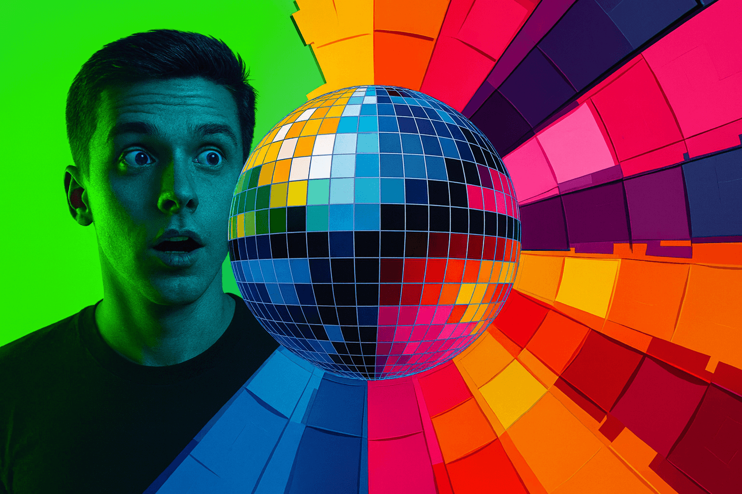
Studies show that strong color contrast draws the viewer’s gaze more quickly (Habitat & Behaviour, May 2023, The Impact of Colour Contrast on Visual Attention). Color also shapes emotion. Design studies explain that vivid colors influence mood and guide perception inside marketing visuals (Journal of Current Researches on Social Sciences, April 8, 2025, Use of Color in Marketing Communication and the Importance of Colors).
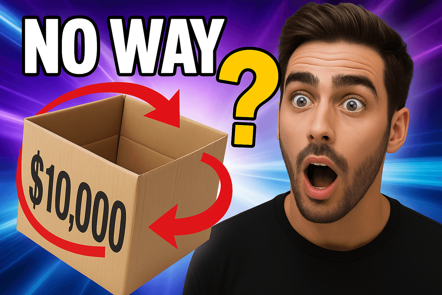
4. The Mystery Bait Technique
This is an ancient technique passed down by YouTube wizards from the days of dial up. The deal is:
Don’t show everything in your thumbnail. Blur it. Cover part of it with a red circle. Add a giant question mark. Give the audience just enough to itch, but make them click to scratch it.
Want an example? Let’s say your video is “Opening a $10,000 Mystery Box.” Don’t show the box contents in the thumbnail. Just show your shocked face, the closed box and a big text: “NO WAY.”
5. Call Outs and Fake UI Elements
Add fake arrows. Circles. “LIVE” icons. Screenshots of tweets. Anything that tricks the viewer’s subconscious into thinking this video is more important than oxygen. They pull the viewer’s eyes to the exact spot you want. They make a normal thumbnail feel loaded with energy. They whisper “something is happening here” before the viewer even reads a word.
Design studies show that simple visual cues guide attention and raise engagement because the human brain follows shapes and highlights before it follows text. (Octet, May 26, 2025, Visual Cues Definition Psychology Types and Applications)
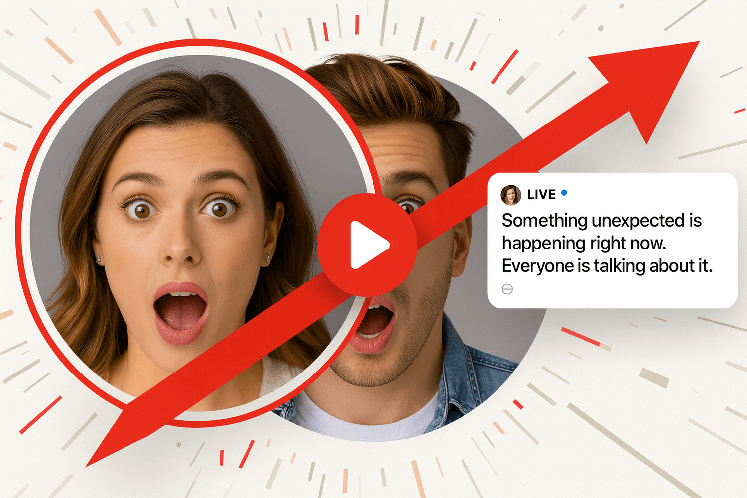
People respond to these elements fast. A bold arrow on a shocked face. A circle around a strange object. A screenshot hinting at drama. These create instant curiosity. They feel like signals from a live feed or an urgent update. Your thumbnail becomes a tiny story frame that promises something worth watching.
Used with honesty this is not manipulation. It is visual persuasion. It is creative power. It makes your thumbnail stand out and gets viewers to stop scrolling for one extra second. That one second brings the click.
If you want to go beyond attention grabbing thumbnails and build a full on channel that earns without even showing your face, check out our Faceless YouTube Channel Blueprint for Bigger Profit for a full guide. If you want to ensure maximum view out of your contents, join $100K Money Hackers to create a wider network with the expert people. Access The Quick $750 Hack if you want to make money very quickly. It is normally of $49 Value. But for readers of The Money Hacker Blog, the discount is 100%!
Frequently Asked Questions (FAQ)
Clear text and a bold face help the scroll stop fast. Strong contrast lifts visibility on small screens.
Hint at a moment without exposing the full scene. Deliver the full value in the video so the viewer trusts the style.
Bright tones spark interest faster than muted tones. Strong color blocks guide the eye toward the message.
A clear expression sets a fast emotional hook. The viewer pauses because humans react to faces quicker than text.
Use a single focal point with sharp clarity. Avoid clutter so the idea lands in one second.
Test small changes like crop, color and text. Keep the strongest version and track the jump in engagement.
Conclusion
If you want to make 2,500 views with just your thumbnail, you have to embrace the fact that YouTube is a visual click first platform. The title and video content matters a lot. But the thumbnail is your invitation and if it is boring, nobody is coming to the party for sure. So, make it loud. Use expressions that hold attention at first glance. Make it whatever can get you clicks (and now you know what that ‘whatever’ is!). I hope to see your growing channel!
If you are very much interested to earn maximum money from YouTube, $10K YouTube Starter Blueprint is a perfect tool for you. This is the ultimate blueprint to make $10,000 using YouTube, even if you are a beginner. You can certainly try for it.


The Money Hacker